MySupplementals / EdTech
Optimizing the college essay gathering process
A web app that merges overlapping college essay prompts across schools into a single, organized Google Doc. Built for students and the counselors who advise them.
- Role
- Founding Product Designer
- Timeline
- March - May 2026
- Team
- 1 Designer (me!)1 Engineer
- Skills
- Landing Page DesignInteraction DesignUX WritingDesign–Dev Collaboration
Overview
Introducing MySupplementals
MySupplementals helps college applicants get through supplemental essays. Students add their school list, and the app pulls every essay prompt from 1,211+ universities, groups the ones that ask the same thing, and exports the plan to Google Docs in one click.
It's built for more than students. High school counselors and private college counselors can use it to plan essays across a whole caseload, and it could be used by schools as a resource.
I worked as a founding designer with a founding engineer, and we reviewed each iteration together in coworking sessions. I owned the marketing landing page and the core web app flow, from picking schools to the final insight reveal.
Impact for students
Research
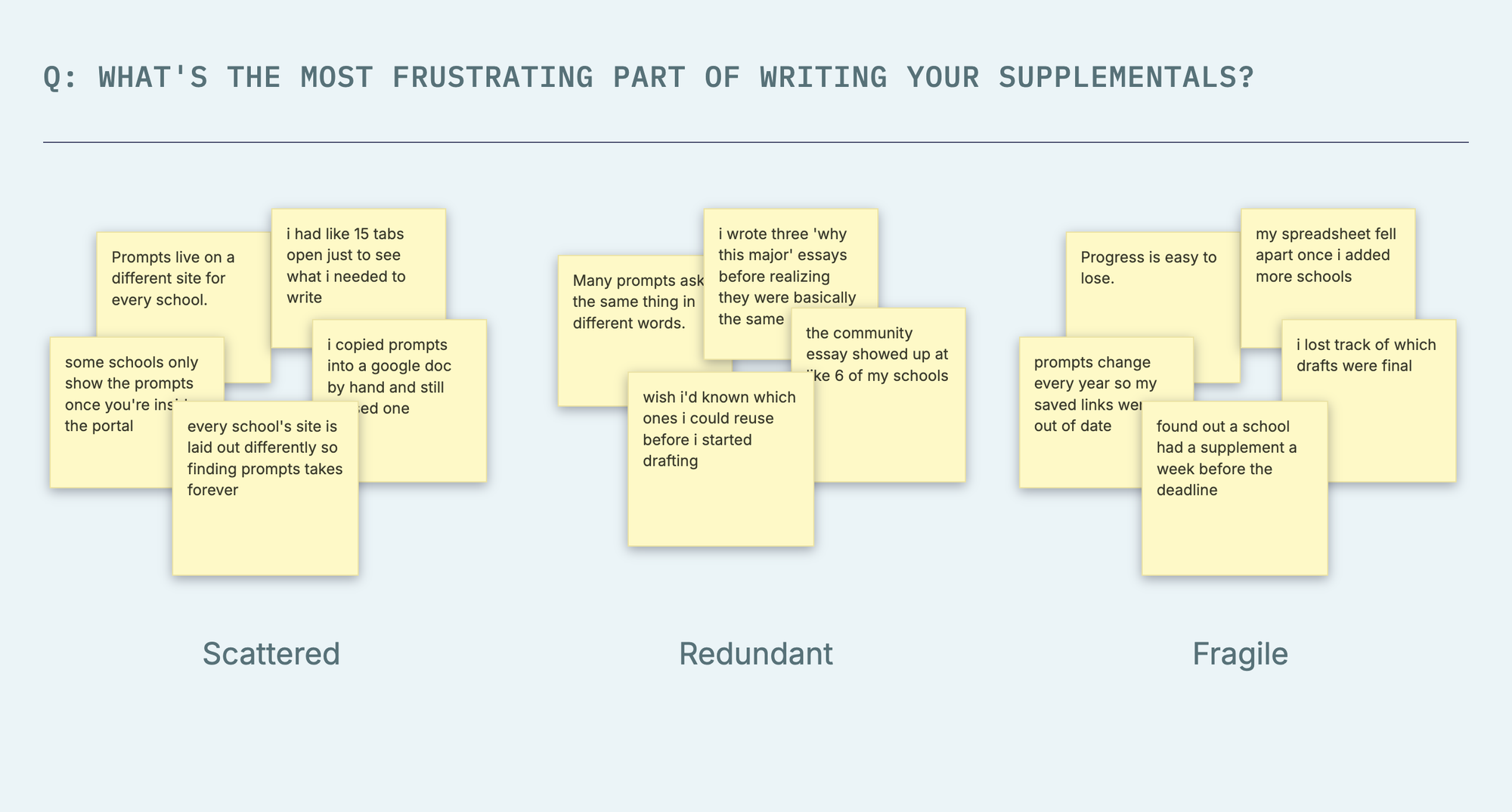
Applying to ten schools can mean 47 essays across 15 browser tabs.
Supplemental essays are where college applications get overwhelming. Every school asks its own questions, but many of them overlap, and students rarely see that until they're deep into drafting.
Scattered
“Prompts live on a different site for every school.”
Students end up juggling a tab per school just to see what they need to write.
Redundant
“Many prompts ask the same thing in different words.”
Without seeing them side by side, students write near-duplicate essays from scratch.
Fragile
“Progress is easy to lose.”
Spreadsheets and bookmarked links break down as the school list grows.
Designing for multiple stakeholders
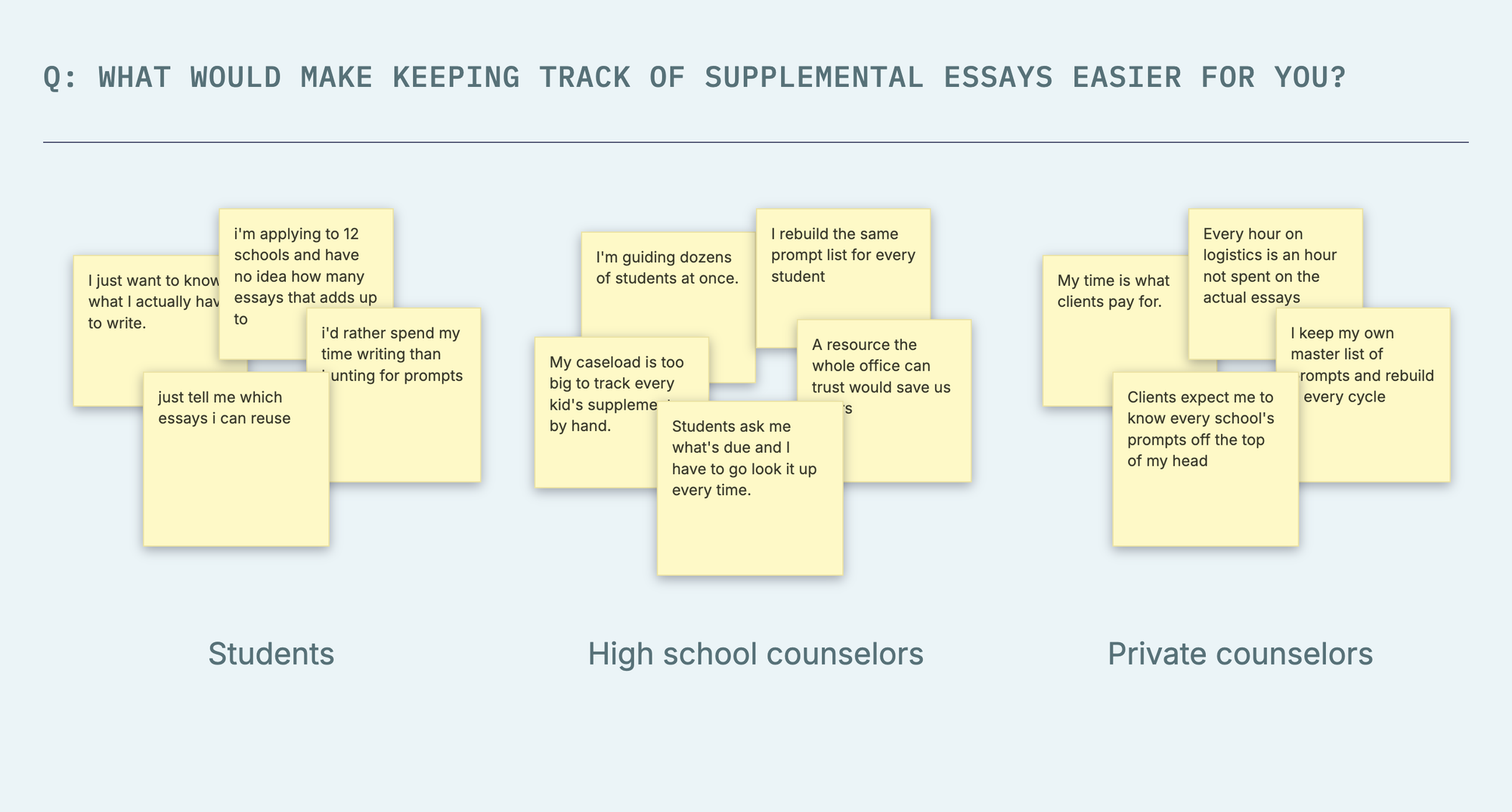
Students
“I just want to know what I actually have to write.”
College applicants juggling 10+ schools need one list of prompts and a way to avoid writing the same essay twice.
High school counselors
“I'm guiding dozens of students at once.”
School counselors need a shared, reliable resource instead of rebuilding prompt lists for each student.
Private counselors
“My time is what clients pay for.”
Independent counselors can spend less time on logistics and more on helping students with the essays themselves.
Opportunity
How might we turn a pile of browser tabs into one clear writing plan, and make the product's value obvious in seconds?
When the founder reached out, he had a creative vision, but no existing prototype. My job was to make build an MVP that felt trustworthy, easy to follow, and rewarding at every step: first on the landing page that sells the product, then in the app itself. The design also had to feel credible enough for counselors to recommend, and for a school to adopt as an official resource.
Iteration 1
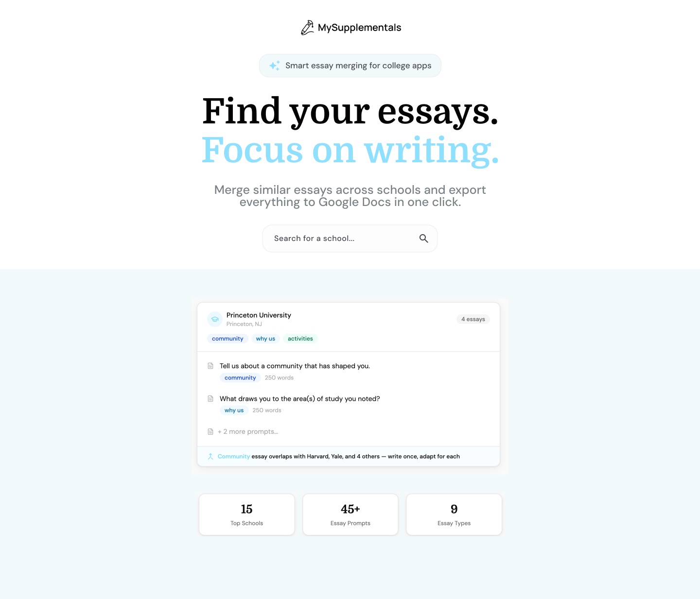
A landing page built around trust
My first draft kept the visuals simple and put the messaging first: say what the app does, show how it works, and give students an easy way in. More branding could come later. The first job was building trust and getting clicks.
Iteration 2
More flexibility made the design worse, not better
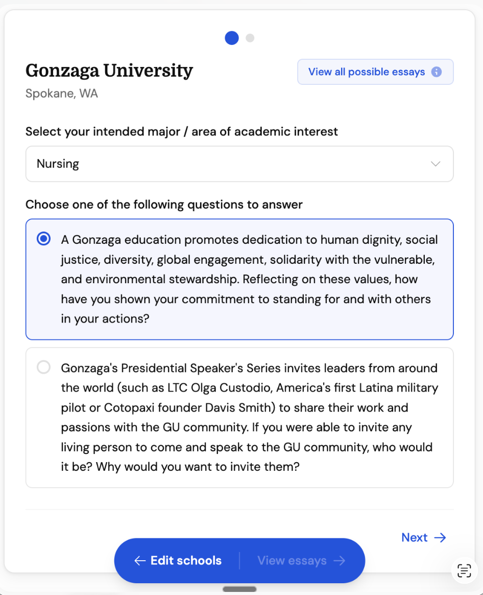
After selecting schools from a search bar, students confirm details for each one based on the Common App. My engineer defined multiple states for the progress indicator: active state, completed state, and incomplete state. For a list that could be 10+ schools, the progress indicator had to answer two questions at once: where am I, and how much is left? This one went through more churn than any other screen, because the underlying need kept getting more complex before it got simpler.
v1 → Dots
This was the engineer's first pass. It didn't scale past a handful of schools and also couldn't communicate anything beyond an active state.
v2 → Progress bar + stepper
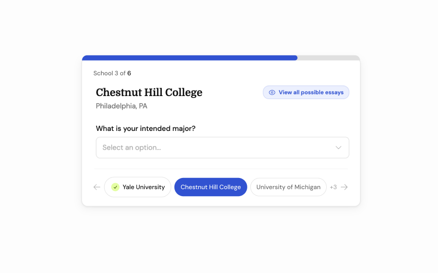
To support all three states, the bottom stepper showed three schools at a time with an overflow count ("3+"). The current school took the primary color, finished ones got a green check, and a progress bar up top gave a louder signal for longer lists.
But this ran into an engineering constraint. The "Next" button was already gated until the current question was answered, meaning a student couldn't jump ahead to an incomplete school even if they wanted to. With that constraint in place, the university names inside the stepper didn't make sense. We also already had the top progress bar communicating overall completion, so the bottom progress stepper was redundant.
v3 → PROGRESS BAR
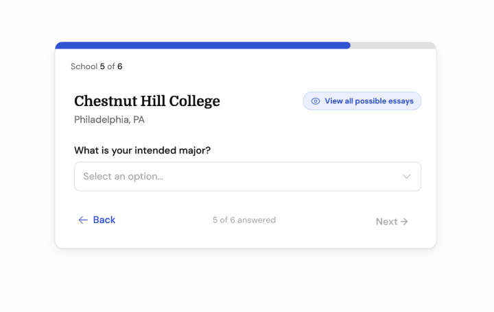
I cut the university names from the bottom stepper, deferring to a simple X out of Y status indicator to reinforce clarity on the user's progress.
Iteration 3
Making the journey feel like a reward
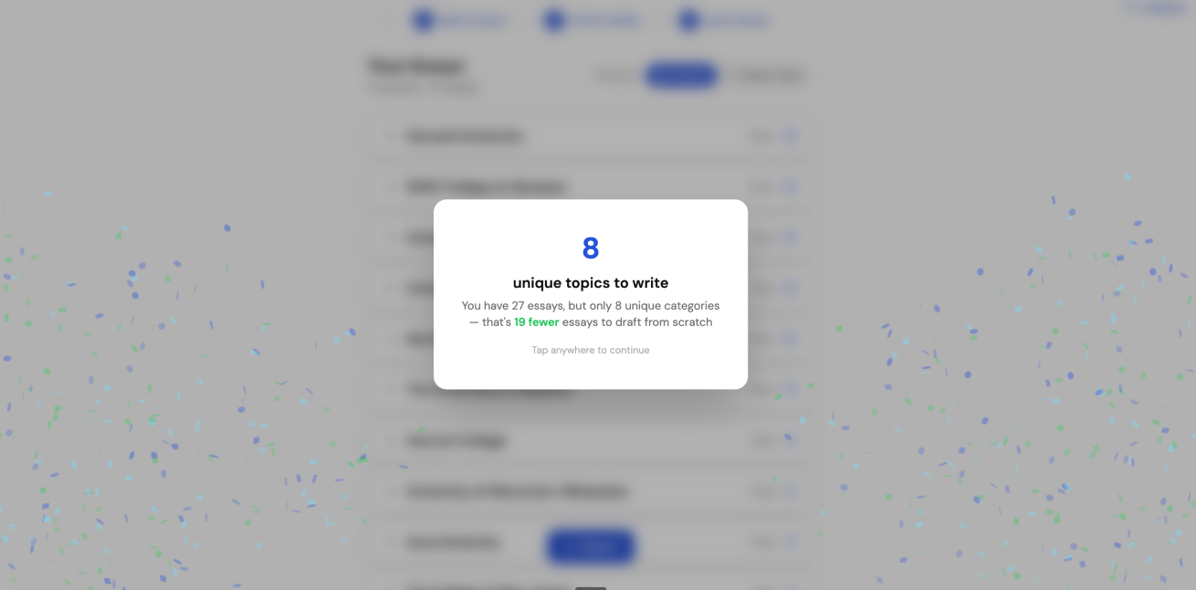
The insight reveal card is where students see how much work the app just saved them. It's the moment the whole flow builds toward, so it went through several rounds.
My engineer initially produced an insight card with a blurred background. After auditing comparable web apps, I found blur was largely absent from the category, and it muddied the card instead of elevating it, so I cut it. In the same round I tested green against blue for the primary accent. Blue read cleaner against the card's other elements, so that's what shipped.
Which impact metric lands best for students?
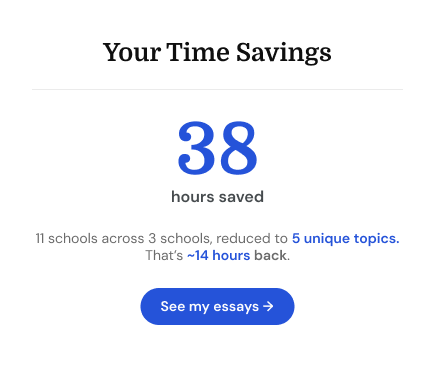
Instead of assuming an impact metric, I explored two competing ones:
1 — Time saved
2 — Unique essays left to write
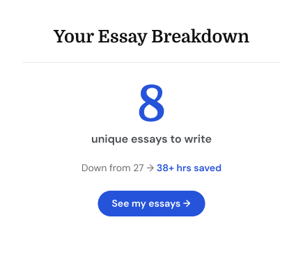
We weighed which gave students the bigger emotional payoff against which more honestly showed what the tool actually did. A smaller, concrete number ("8 essays to write") beat an abstract one ("38 hours saved") on both counts.
Iteration 4
Designing around features that existed before the UX did
Sometimes in fast startups, engineers, especially ones that are founders, develop features before a designer defines them. Partway through, my engineer shipped smart saving, where changes are saved even if the tab closes. As a result, I needed to design reactively, or at least in parallel with my engineer, to map out the user journey and more complex states.
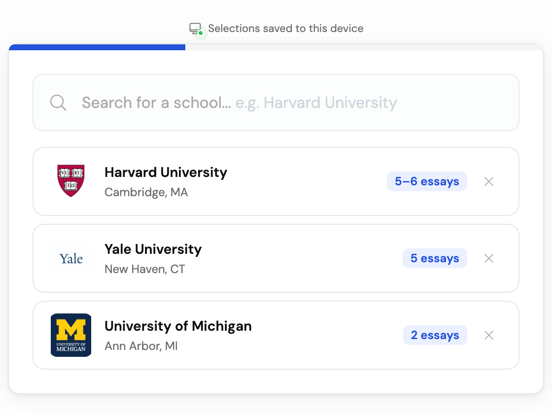
Making smart saving visible
I proposed a save-status indicator based on a mental model students already trust, Google Docs' autosave, in two states. Green confirms their own selections are saved. A warning color flags that they're viewing someone else's data (ex. a college counseler viewing a student's list).
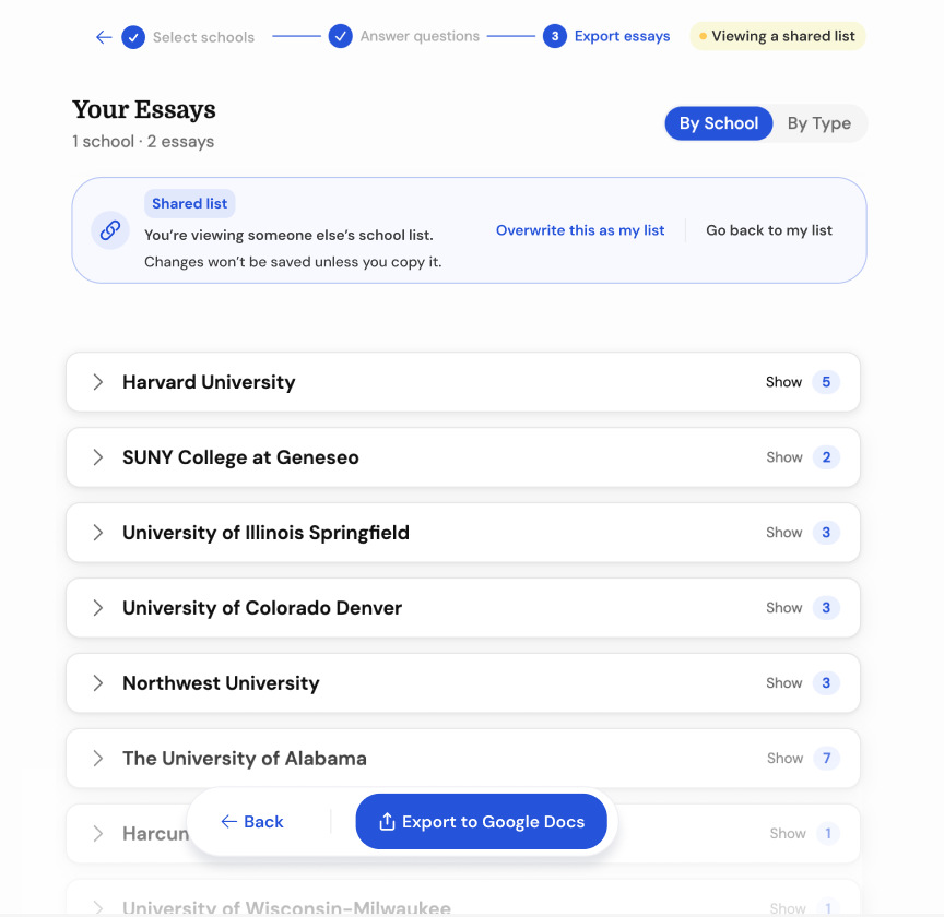
Edge Case: When someone's shared link collides with your own saved progress
What happens if a student opens up a friend's shared link, and they edit changes or want to make a copy of it for themselves? Do we enabled smart saving here and overwrite their own list?. We came up a persistent modal that prompts users to either overwrite changes or go back to their own list, with a clear indicator at the top making the shared view status visible. However, after much deliberation, we decided to push this to a future phase because it did not cover a core Job to be Done.
Edge Case: Letting students export first and answer questions later
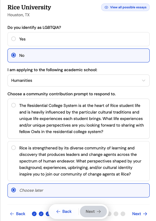
Some schools require extra essays for specific departments or scholarships, which the Common App determines through a string of conditional questions. Making students answer all of those before reaching their essay list is the highest-friction point of the user journey, and letting students defer that decision meant they could reach value faster.
Rather than forcing a choice immediately, I included a "Choose later" option alongside the actual prompts in V3.
Outcome
Where it's landed
MySupplementals is live, and the founder is now working on marketing. Next is reaching students directly while positioning the app as a resource counselors and schools can offer.
“Once Carolyn was on the project, I stopped second-guessing the design. She took my half-baked ideas for MySupplementals and transformed them into screens that felt finished on the first pass. Fast, thoughtful, and easy to work with.”
Reflection
On being an opinionated designer
Tuhin Kumar, an early designer at Facebook and Airbnb, describes 0→1 as a designer's chance to put a signature on something. His point is that really well-designed products have an almost art-like quality that doesn't come from a purely rational process. They have an essence that speaks to people on a gut level. When someone asks why you did it that way, sometimes the honest answer is:
“Honestly, I just thought it was better.”
For two founders in the early stages, that was a lot of MySupplementals. For example, I scrapped the dot progress steppers because they looked funky compared to a progress bar. Alternatively, I eliminated the blurred background from the insights popup modal screen because I didn't like how it felt. Together these craft-based decisions are what make the product feel like a real, lived-in thing.
But knowing when taste should give way to strategy matters just as much. For example, letting a technical constraint delete a feature instead of complicate it, or adding friction on purpose in front of a destructive action. Knowing when a business need (ex, a counselor's trust or a school's adoption) should outrank a personal preference, mattered as much as taste. Ultimately, every decision in this project came back to one question: what actually serves a stressed-out student staring down 47 essays?